Forget your endless watchlists, they are dead by 2026
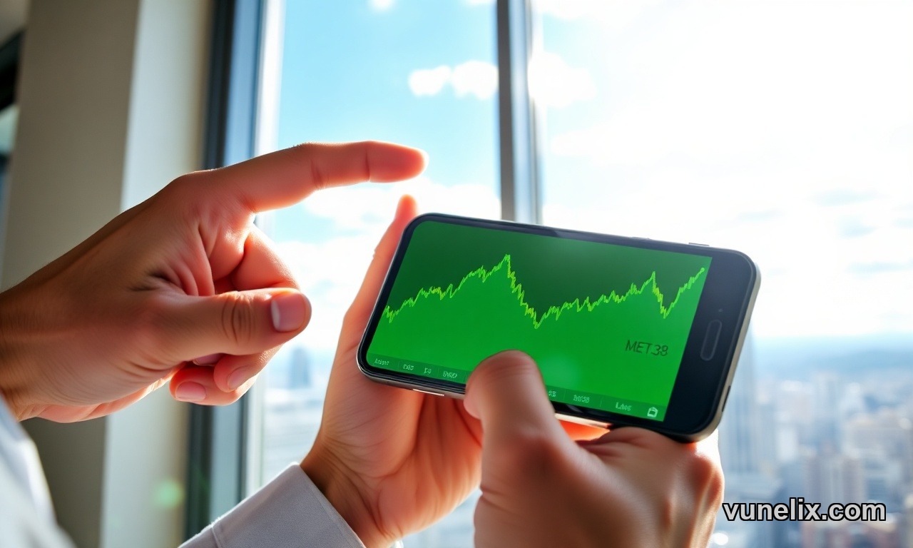
You trying to keep up with thousands of crypto coins using a spreadsheet? Good luck with that. The market moves too damn fast, a coin can pump 50% or crash overnight, and your little list just won't cut it. You need a better way to visualize what’s happening, something that screams "buy or sell" in one glance. This is why learning how to use crypto heatmap tools is absolutely non-negotiable now.
What you need, what everyone needs, is a crypto heatmap. It’s not just pretty colors, its a real-time snapshot of market sentiment, of actual money flowing in or out. Without it, you’re flying blind. Seriously. I once missed a major altcoin pump because I was stuck refreshing price tables like a dinosaur. Never again.
What a Crypto Heatmap Even Is, and Why It's Vital for 2026
Alright, so what exactly is this thing? Think of it like a giant grid of blocks, right? Each block is a crypto coin. Bitcoin, Ethereum, they take up the biggest space because, well, they have the biggest market cap. But meme coins like DOGE, PEPE, all the DeFi tokens, Layer 1s, they're all there too. Over 5000 of them on Vunelix, it’s comprehensive.
The colors are simple: green means prices are up, red means prices are down. Easy. But the key thing, and where too many beginners mess up, is the shade. Darker green? That’s a monster move up. Bright red? Big crash. Light green or pinkish red, small changes. It gives you an immediate read on momentum. Vunelix, for example, tells you bright green is like 3-7% gains, while deep green means 7%+ moves. Crucial difference when you’re looking for action.
You can flip between 1-hour, daily, or even weekly views. That's a huge deal. Catching intraday pumps versus spotting longer trends requires that flexibility. And filtering? Absolutely, you can focus on DeFi, stablecoins, gaming coins, AI, whatever sector is hot or you're interested in. Don't waste time looking at everything when you just want to see if your AI plays are printing.
How to Use Crypto Heatmap for Quick Analysis Today
Right, so you got this colorful grid in front of you. What next? First, look at the big blocks. Bitcoin and Ethereum. Are they green or red? How dark? If they're both deep red, everything else is probably getting crushed. If BTC is dark green but ETH is barely moving, you know where the money is flowing.
- Timeframes Matter: Always check different timeframes. A coin might be deep green on the 1-hour, but light red on the daily. That tells you it's seen a recent pump but maybe it's still down for the day. Or, conversely, a daily deep green means sustained buying. Vunelix offers 11 timeframes, which is overkill for some, but essential if you day trade and also want to keep an eye on longer term performance.
- Filter by Category: If you're into gaming tokens, just filter for those. See if they're all green, or if one specific gaming token is standing out. This is how you spot sector rotation. If DeFi is all deep red and AI is all deep green, guess what? Money is moving out of DeFi and into AI. Simple pattern recognition.
- Hover for Details: Don't just stare at the colors. Hover over a block on the cryptocurrency heatmap. Vunelix shows you the price, 24h volume, market cap, circulating supply, and all those percentage changes. Quick data hit without opening a new chart. It's smart.
This isn't just about pretty colors, this is about identifying patterns that lead to profit. When DeFi tokens suddenly go bright green while everything else is bleeding, that's a signal. When a mid-cap coin shows deep green among a sea of lukewarm moves, you investigate. It reveals the story, not just the data.
My Crypto Heatmap Review: Why Vunelix Works
Traditional watchlists, price tables, they’re too slow. I mean, honestly. You need to monitor hundreds, thousands of assets. Vunelix's crypto heatmap solves this by putting the entire market right there, instantly. It’s like, one glance and you know if it's a Bitcoin day, an altcoin season, or a full-on market capitulation.
I've used other tools, they're fine. But the flexibility to group by sector and switch timeframes quickly is what makes Vunelix stand out. It’s good for spotting those quick pumps that make a day, or even a week. My personal record on a meme coin pump? Saw it turn deep green early morning, jumped in, 20% in an hour. Didn't even need to open a chart initially, just the heatmap. Made my day.
Signal vs. Price Action: Are They Aligning or Diverging?
This is where it gets interesting, and where you separate the pros from the newbies. Price action is what you see on the heatmap: the greens and reds, the size of the blocks. Signal is the underlying reason. It’s the news, the fundamentals, the sentiment, whispers in the market, even big whales moving funds around.
Ideally, they agree. Big positive news for a project, and its block on the heatmap goes deep green. Great. But sometimes they diverge, and that's usually where the really big opportunities, or the really big traps, hide.
- Divergence Example 1: You hear some FUD (fear, uncertainty, doubt) about a major altcoin, like a bug in its smart contract or something. But you look at the heatmap, and its block is holding strong, maybe even light green. That’s divergence. The market isn't reacting as expected. Maybe the news is overblown, or smart money is accumulating. You investigate.
- Divergence Example 2: There’s massive hype about a new gaming token, everyone on social media is screaming about it. You check the heatmap, and its block is barely green, or even red. This tells you the retail hype isn’t translating to real buying pressure. Red flag. Get out.
My biggest loss last year? It came from ignoring this. I bought into a coin based on some "alpha" I heard, but the heatmap showed it was barely moving green even on a generally bullish day. The signal felt strong, the price action was weak. I should've listened to the heatmap. Ended up down 30% before I finally cut my losses. Price action often speaks louder than narrative. Always.
And yeah, for FX Pricing too, these visualization principles apply. Knowing how to read the underlying flow, the momentum, saves you from emotional trades.
How to Interpret Crypto Heatmap Colors for Buy or Sell Decisions Today
It's not just "green good, red bad." Not that simple. Here's a quick breakdown to guide your decisions for 2026:
- Deep Green (7%+ up): Strong buying pressure. If it's a big market cap coin like ETH, could signal a broader altcoin run. For a smaller cap, it’s a strong pump, possibly a short-term trade, but maybe already overheated.
- Bright Green (3-7% up): Moderate gains. Could be sustainable, especially if volume is also up. A good spot to look for entries if you missed the initial deep green.
- Light Green (1-3% up): Small gains. Could be consolidation, or maybe early signs of a trend reversal from red. Or just stagnation. Keep an eye on it.
- Light Red (1-3% down): Minor losses. Could be profit-taking or just a healthy pullback. Nothing to panic about usually.
- Bright Red (3-7% down): Moderate selling pressure. If it's a coin you hold, definitely look closer. Maybe time to trim. If it’s a big coin, might drag the rest down.
- Deep Red (7%+ down): Heavy selling. Could be a major FUD event, or simply a capitulation phase. Sometimes this is a good spot to buy if you're a brave contrarian, but only if you've done your research and believe in the asset long-term. Otherwise, stay far away.
The size of the block alongside the color is your most powerful combo. A huge Bitcoin block going deep green means a very different market dynamic than a tiny meme coin block doing the same. One impacts everything, the other, probably just a few degenerates like me.
This is all about getting information quickly, making a decision, and then executing. Stop overthinking it.
Explore more tools and market data on Fxpricing.